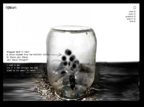
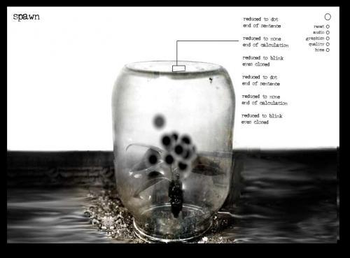
Andy Campbell’s “Spawn” is visually constructed as an image of a glass jar turned upside down with a plant in it. Dark circles hover above the plant. If the reader/user points the cursor to one of the hovering dark circles, a text is “spawned” outside the jar. If the reader/user clicks, an extra layer of visual or textual elements appears which flows around, over, and above the jar and the initial text. The black circles (resembling fruit flies) and the texts that are connected to each one have titles such as “*fact (only),” “tackedown,” and “| | | | | | | |.” There are ten of these texts.
Clicking on the circles generates a second different text, which moves across the window, spins around, and changes. This goes on until the reader/user clicks again on another black circle, calling up another second textual layer. As the second layer moves and changes, the changing size and placement of letters and symbols oscillate between covering the entire window and shrinking to a smaller size. Since the background in “Spawn” is white in the upper half of the window and gray-black in the lower half and since, in some of the second texts, the letters are white, as they spin around, the letters become invisible over the white background and are only readable when they move across the image of the jar and the darker background. Obviously, then, the movement of the texts makes the reading of them quite difficult. The constant movement of the second texts and the moving black circles require the reader to be alert and to wait for the right moment to read the texts.
In addition to movement and color, some of the texts have unorthodox typography. Some of the titles, as noted, also use typographic marks interspersed with the letters. In the section named “pinned,” the following lines in the second text appear:
(i)
( ) – ( as )
(Do) – (wn)
)( only )( (br)e a(k)-( )
It may not be very difficult for the reader to parse the lines: they can quite easily be read as “I,” “as,” “Down,” “only,” and “break.” However, the typographical excess in these lines along with the fact that they perpetually shift between a right side up and an upside down alignment, as well as shift position vis-à-vis each other, produces a challenging, animated reading experience.
“Spawn” requires the reader to negotiate the work’s animated surface to figure out what is needed for texts and images to appear. The reader actions in “Spawn” consist of hovering over the circles and clicking in order for all the parts of the work to play out. But those simple actions are resisted as the cluster of black circles (partially hiding each other) spin around and seem to glide away under the touch of the mouse cursor. Getting to all ten texts requires considerable patience from the reader. The reading of the kinetic second texts also requires time. Although the reader is free to click on any of the black circles at any time, the playing out of the second texts cannot be steered by the reader, but operates according to its own (preprogrammed) time.
This entry borrows from Maria Engberg’s “Aesthetics of Visual Noise in Digital Literary Arts” Cybertext Yearbook 2010. http://cybertext.hum.jyu.fi/index.php?browsebook=7

Discussion
Feedback
This entry has great details on how the work operates, and offers interesting connections happening at the level of interface, but I think some broader context--esp. higher-order analysis of what the work might mean or statements about what it's trying to accomplish--would really push it to the next level.